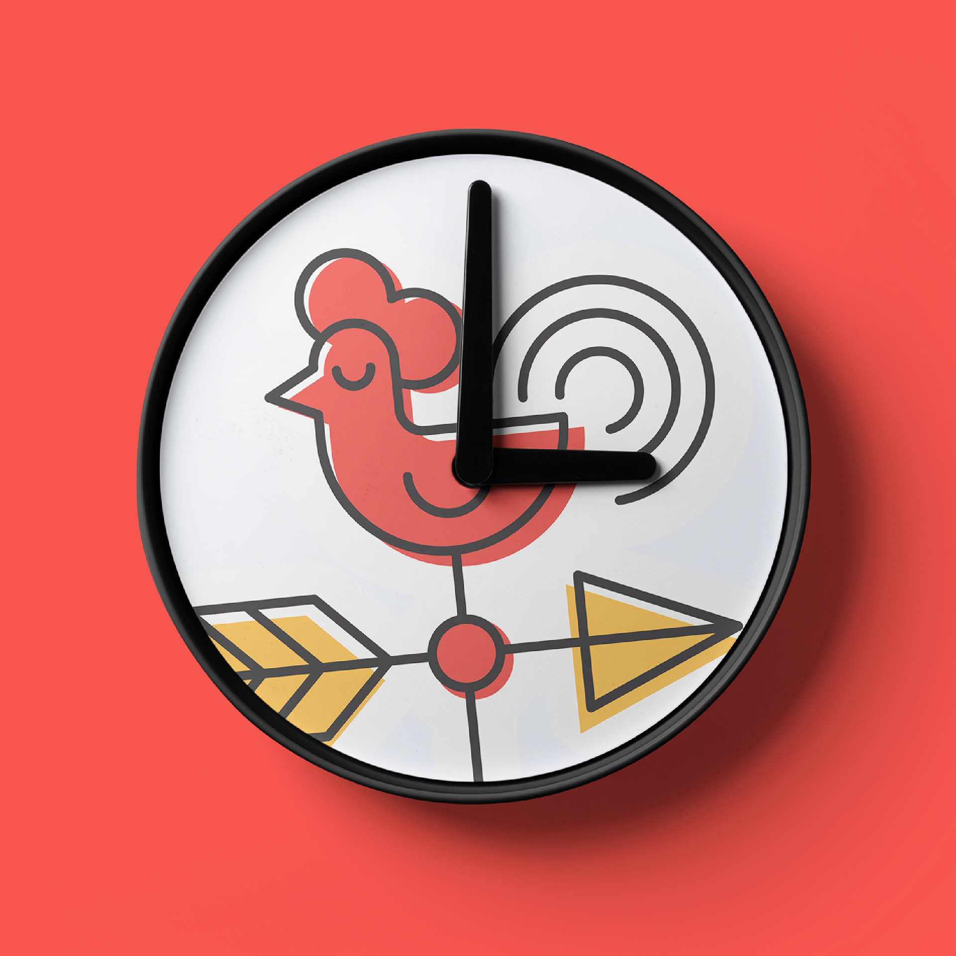


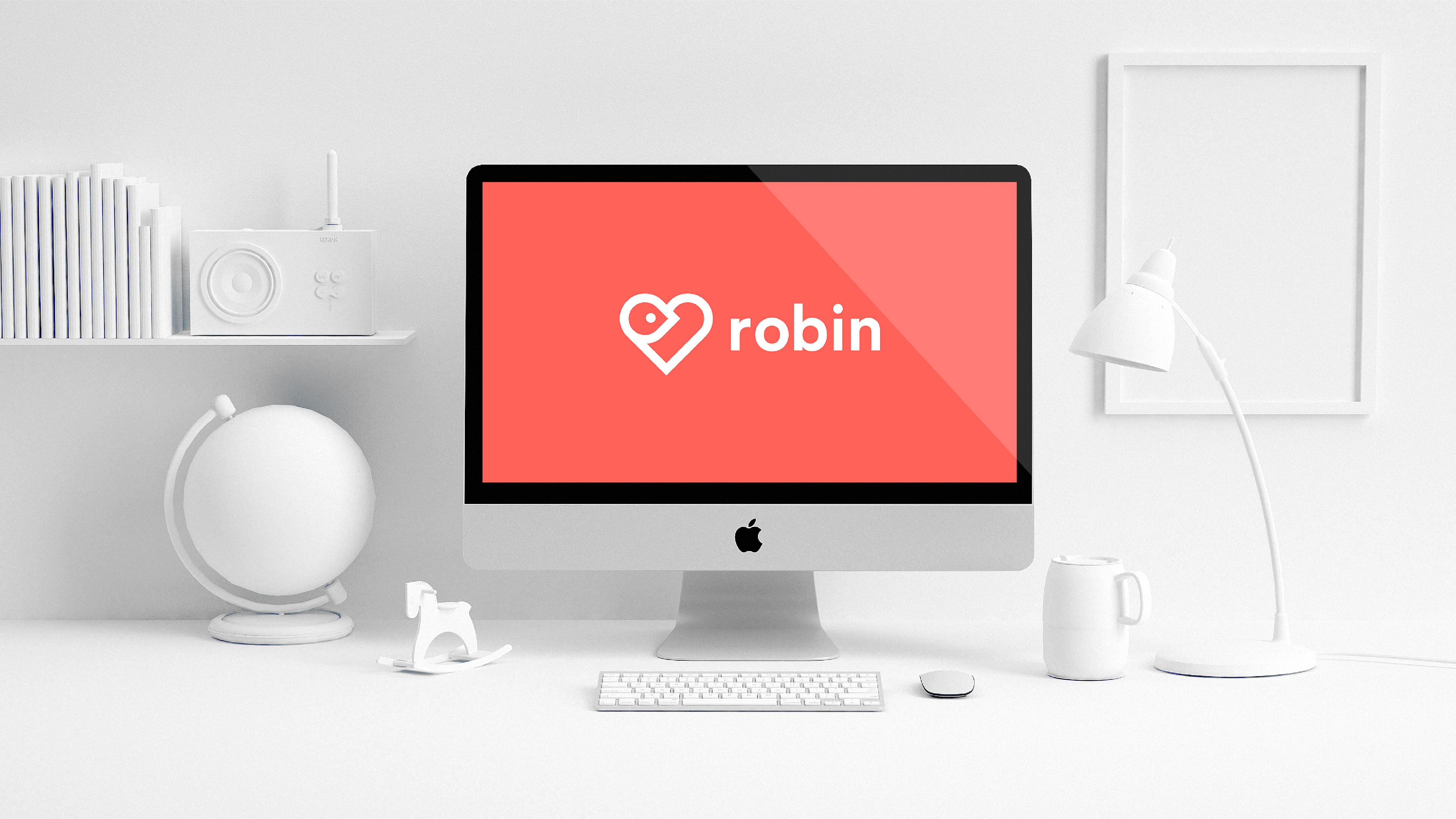
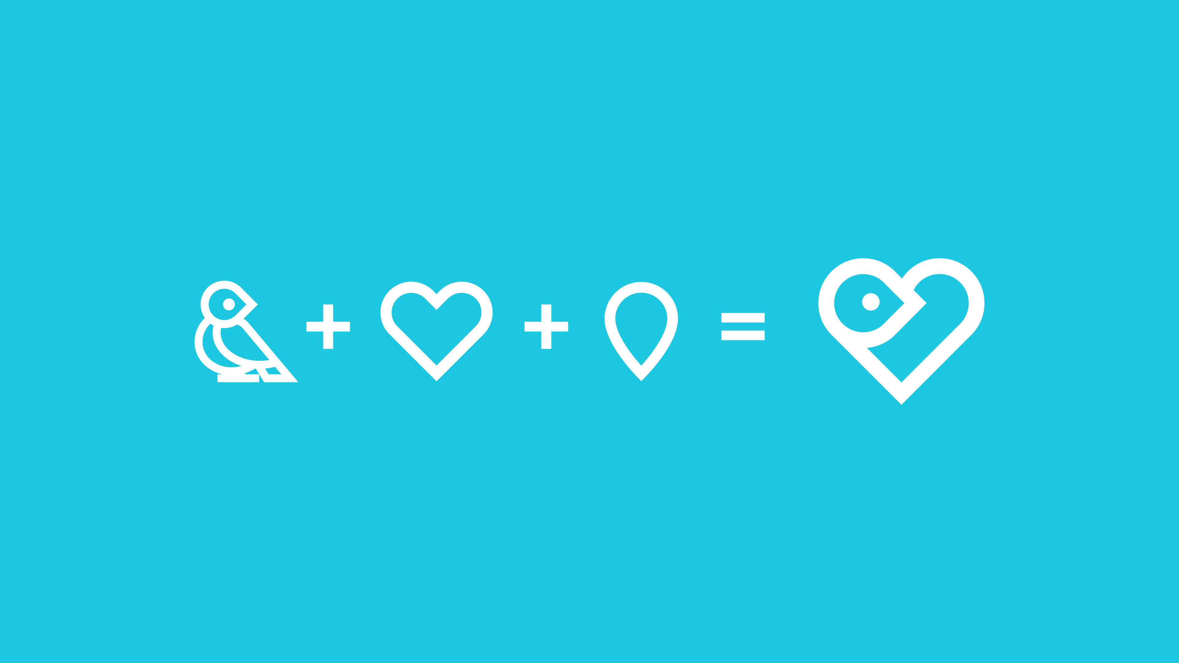
This graphic explains how I combined the concepts of a map pin, a “favorite” heart icon, and a bird to create the logo design for Robin.
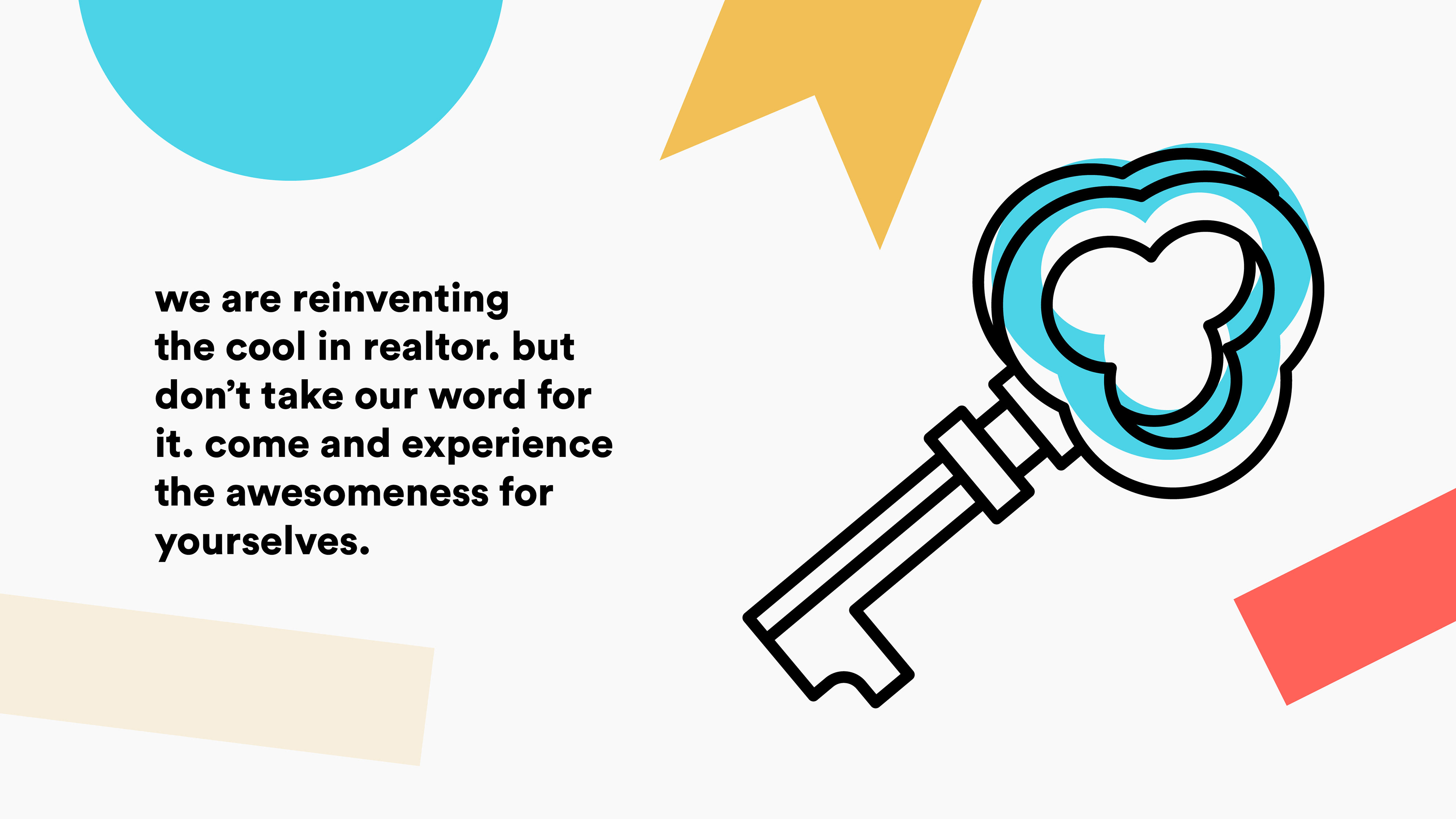
The tone of voice and brand language for Robin is fun, friendly, and approachable.
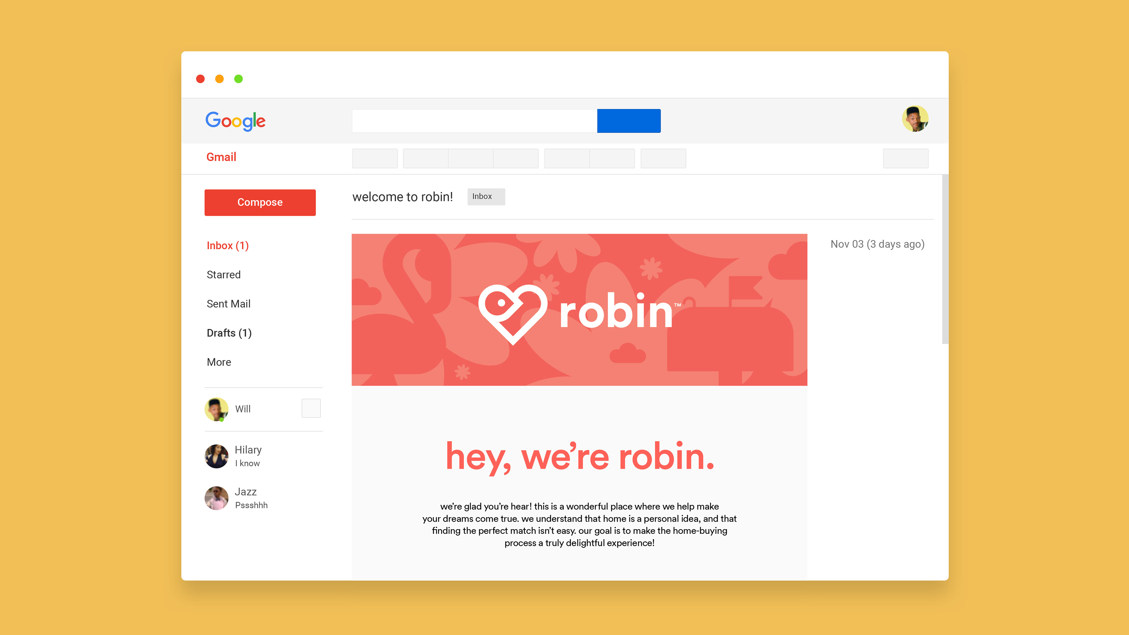
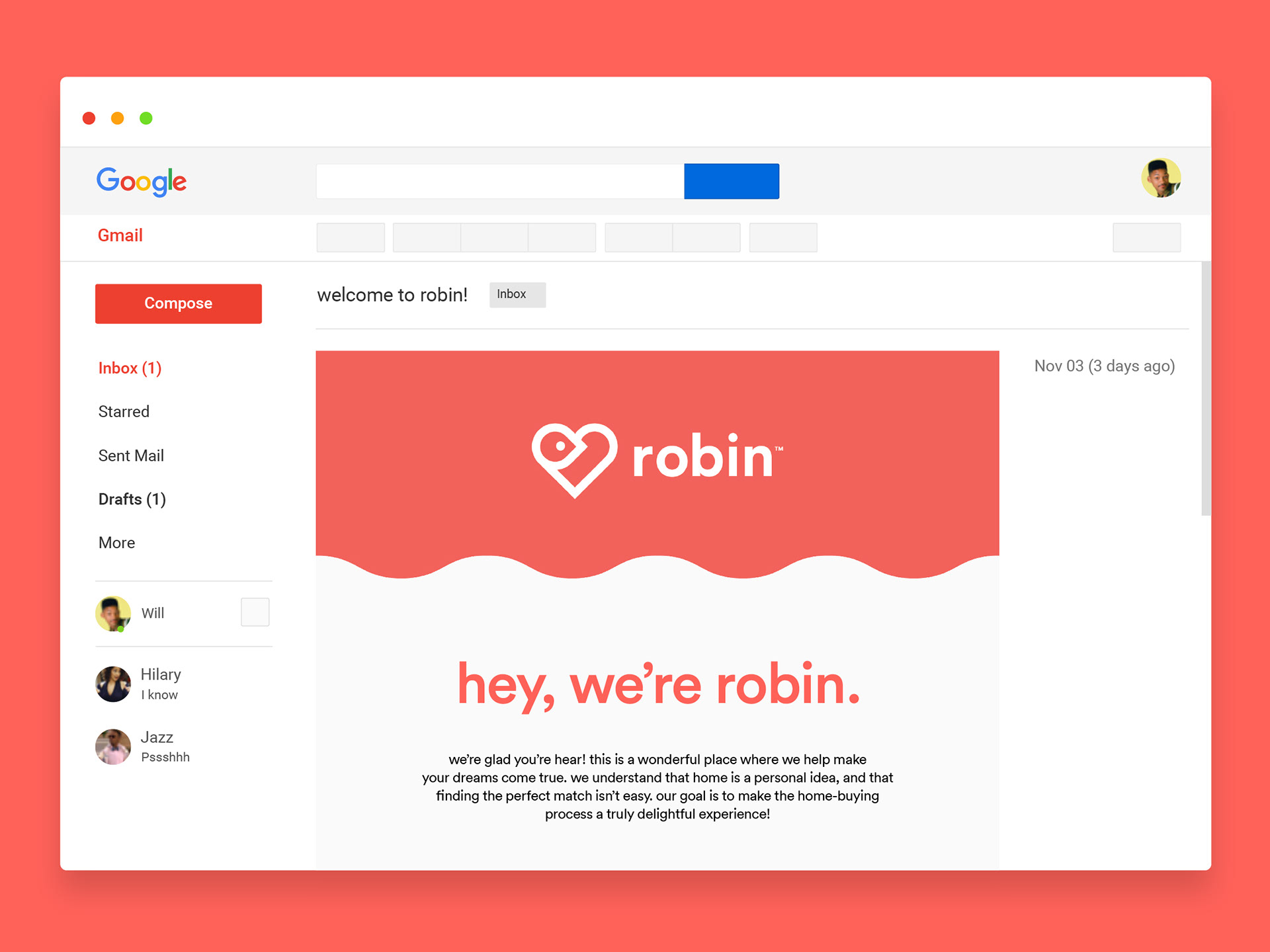
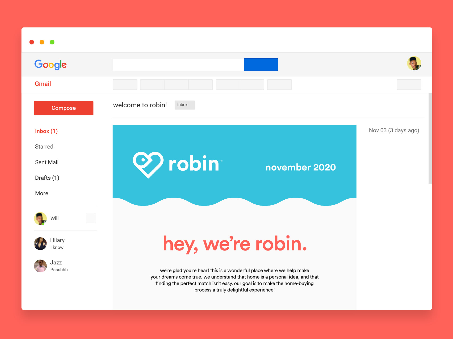
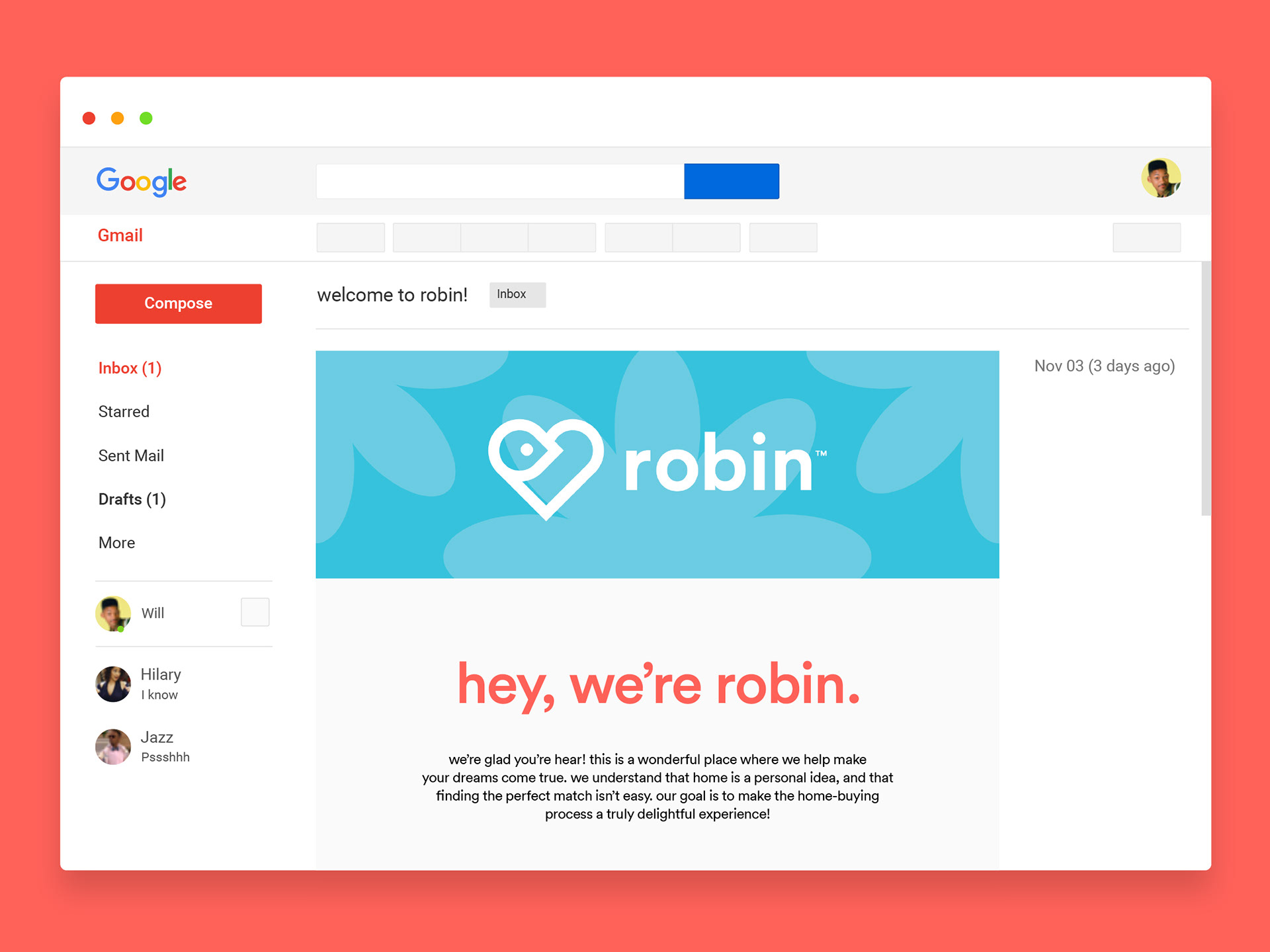
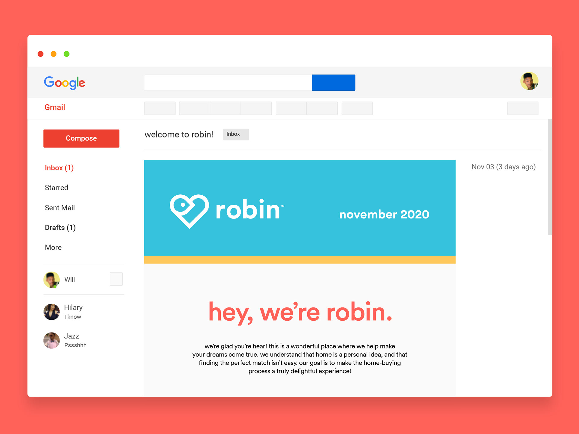
Several email headers were created to give our client a variety of designs to choose from.
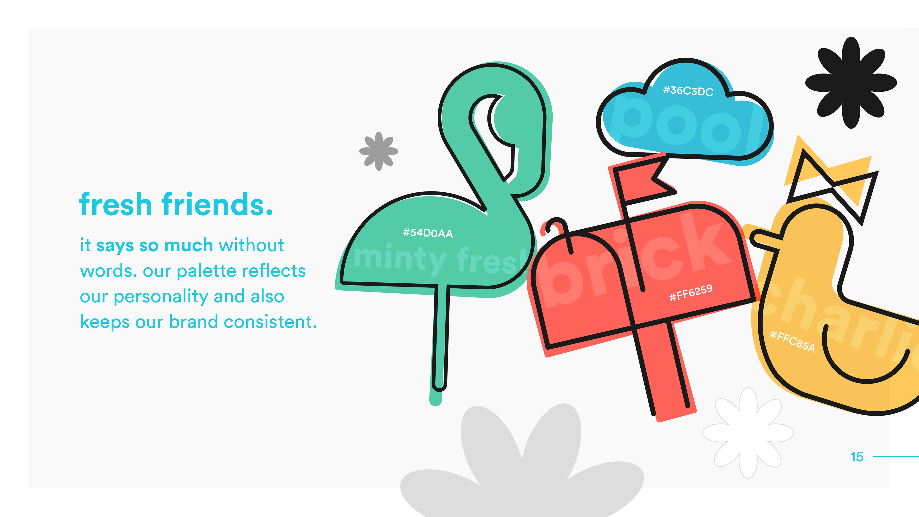
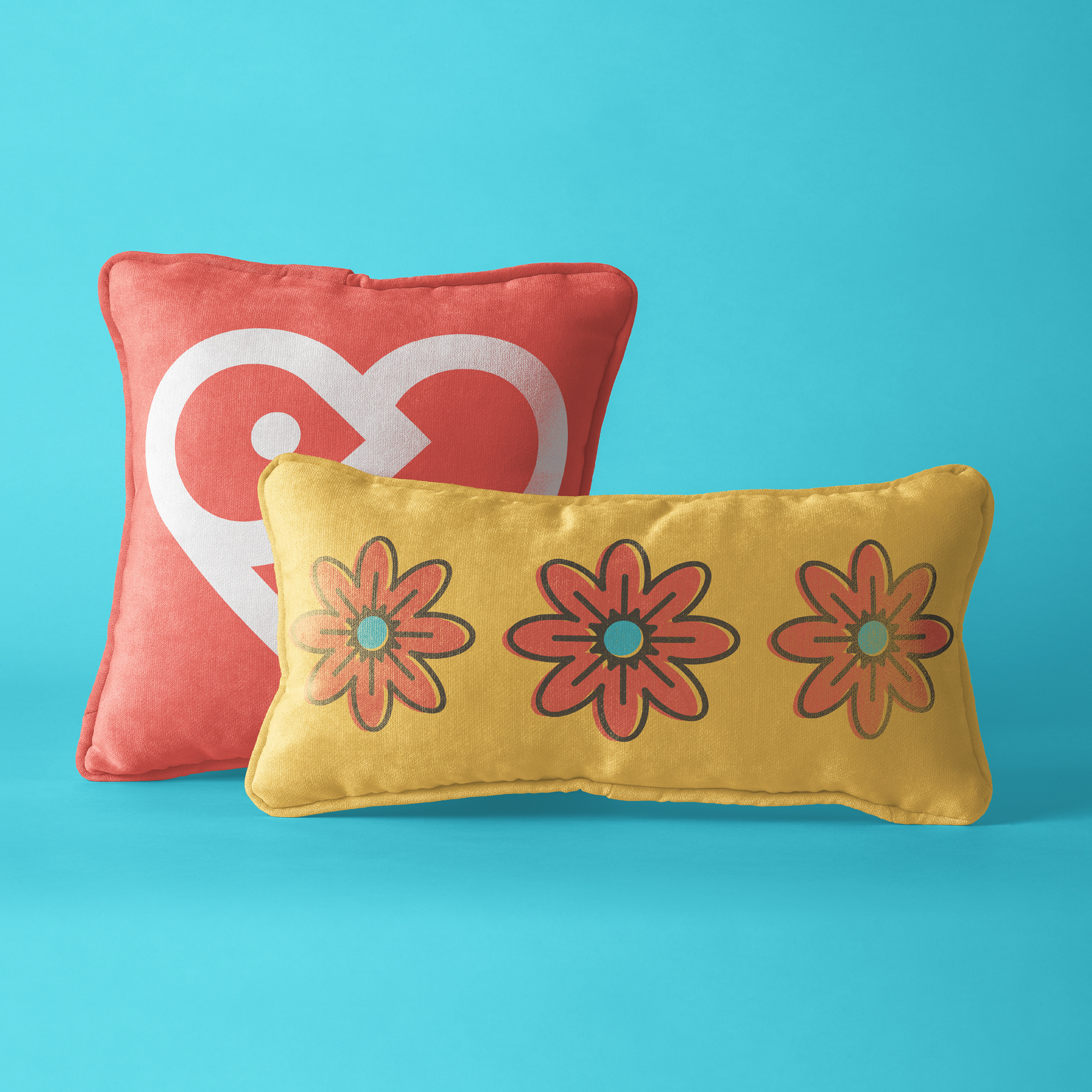
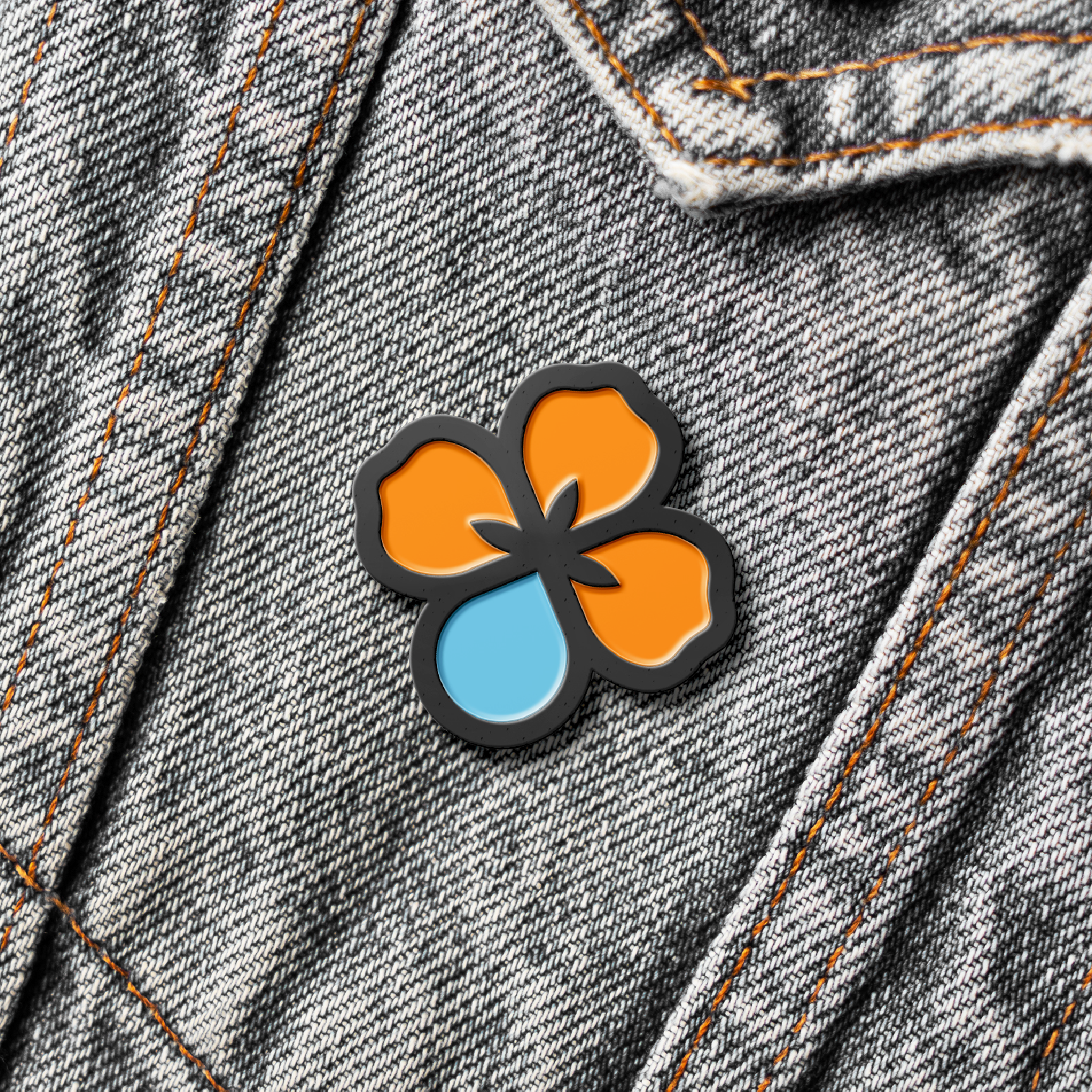
Colors were chosen to pair with the robin's-breast red logo color including a robin's egg blue.
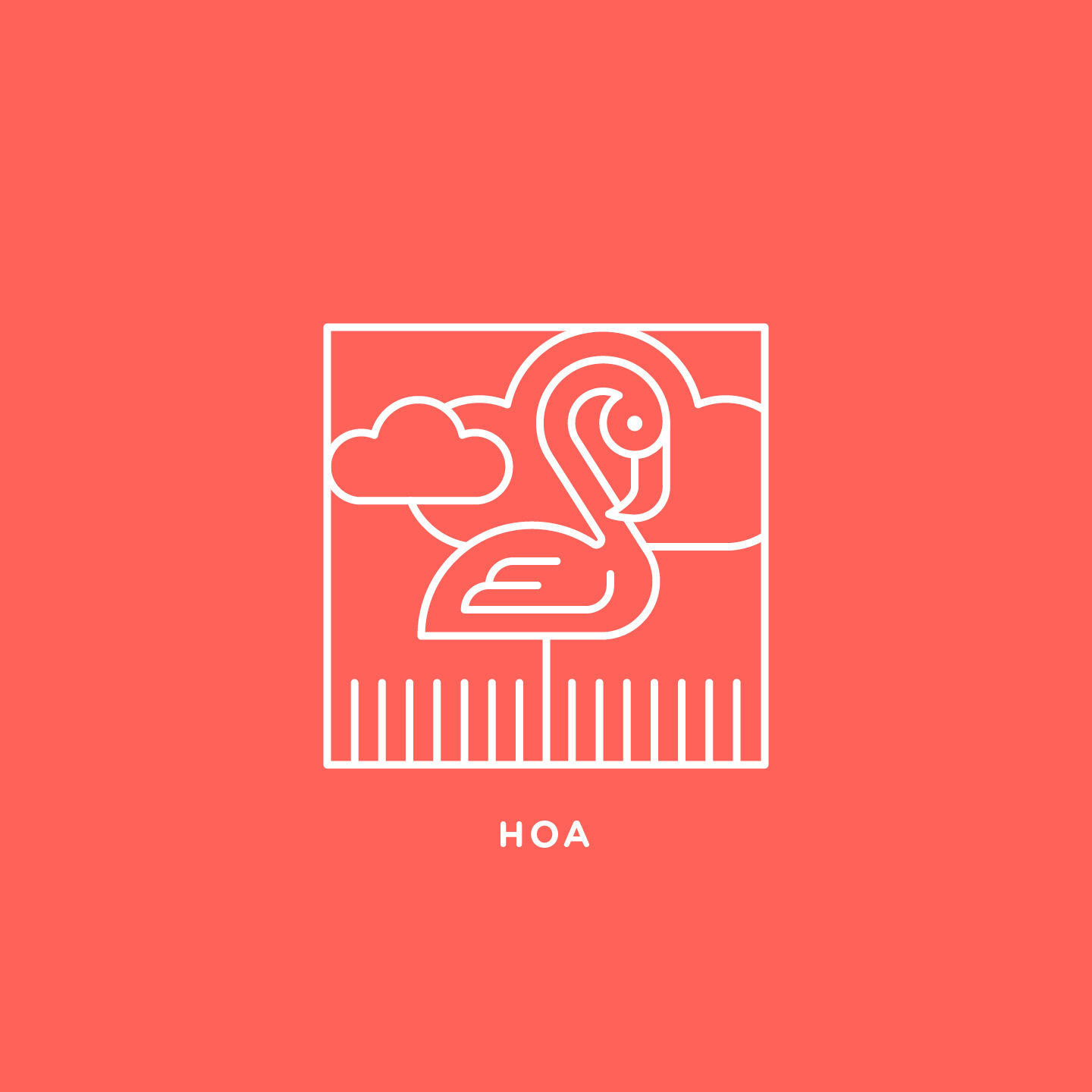


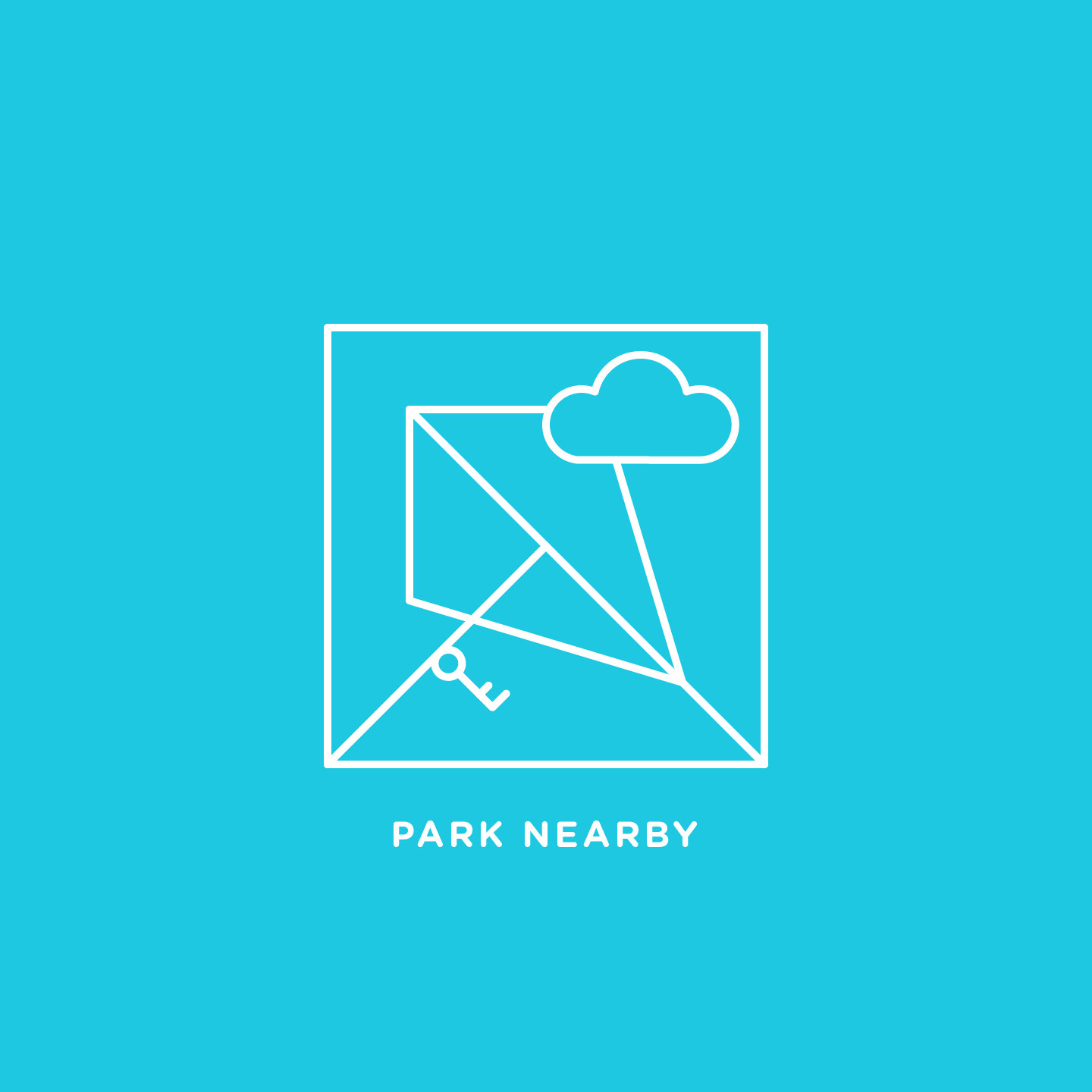
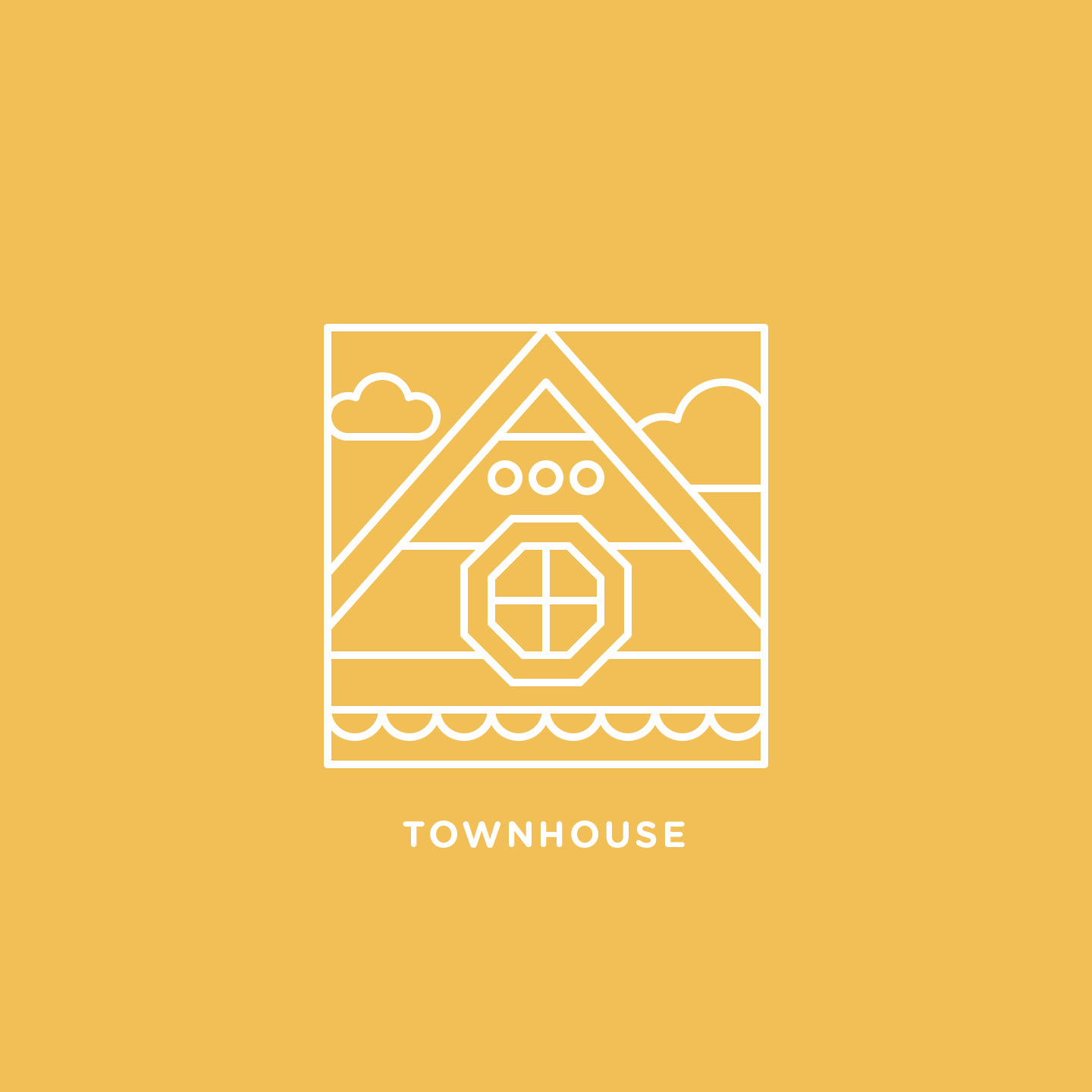
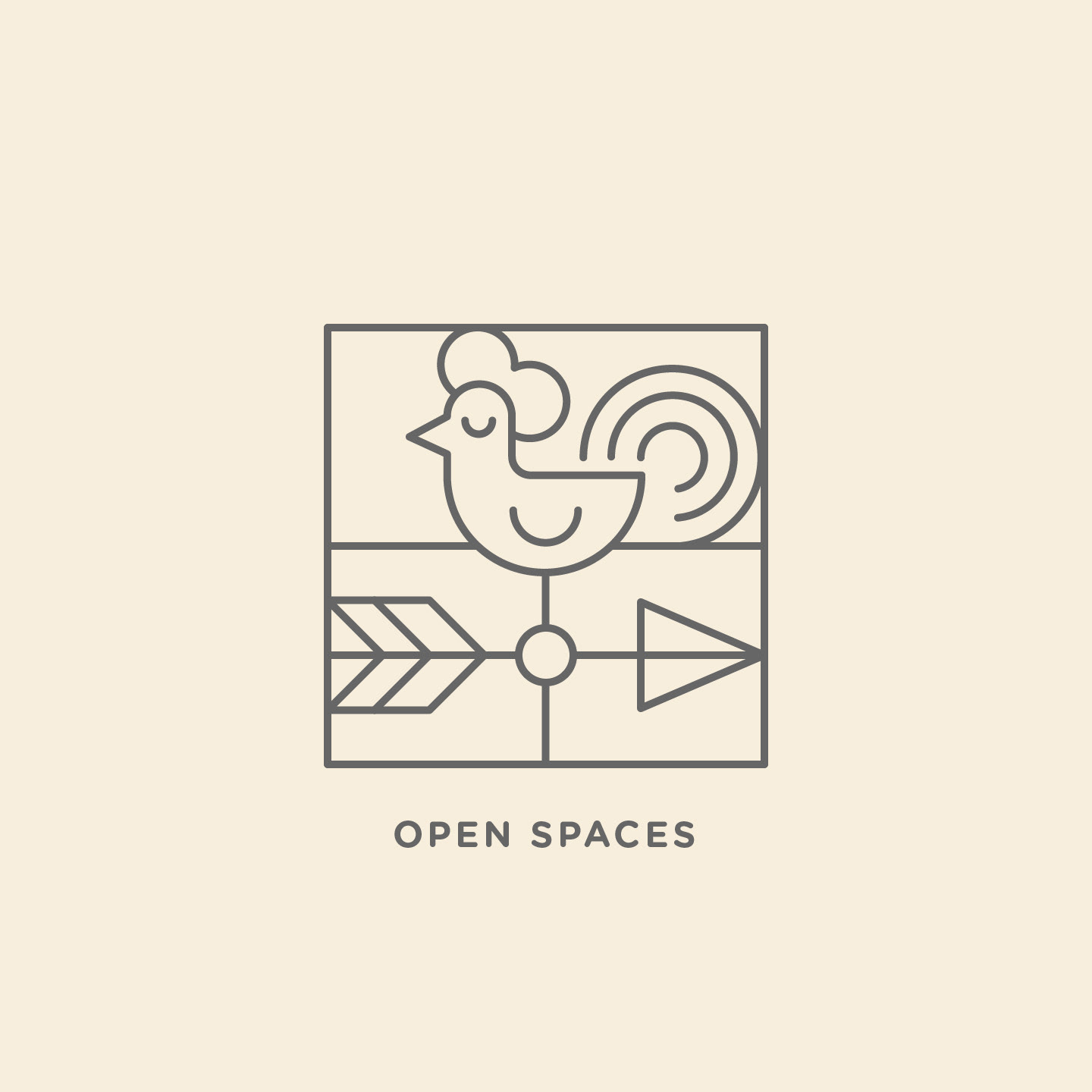
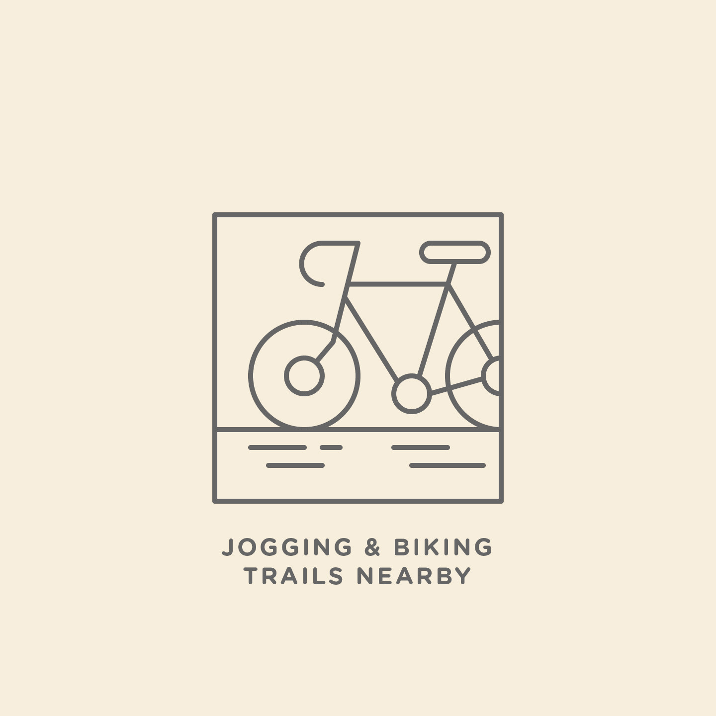
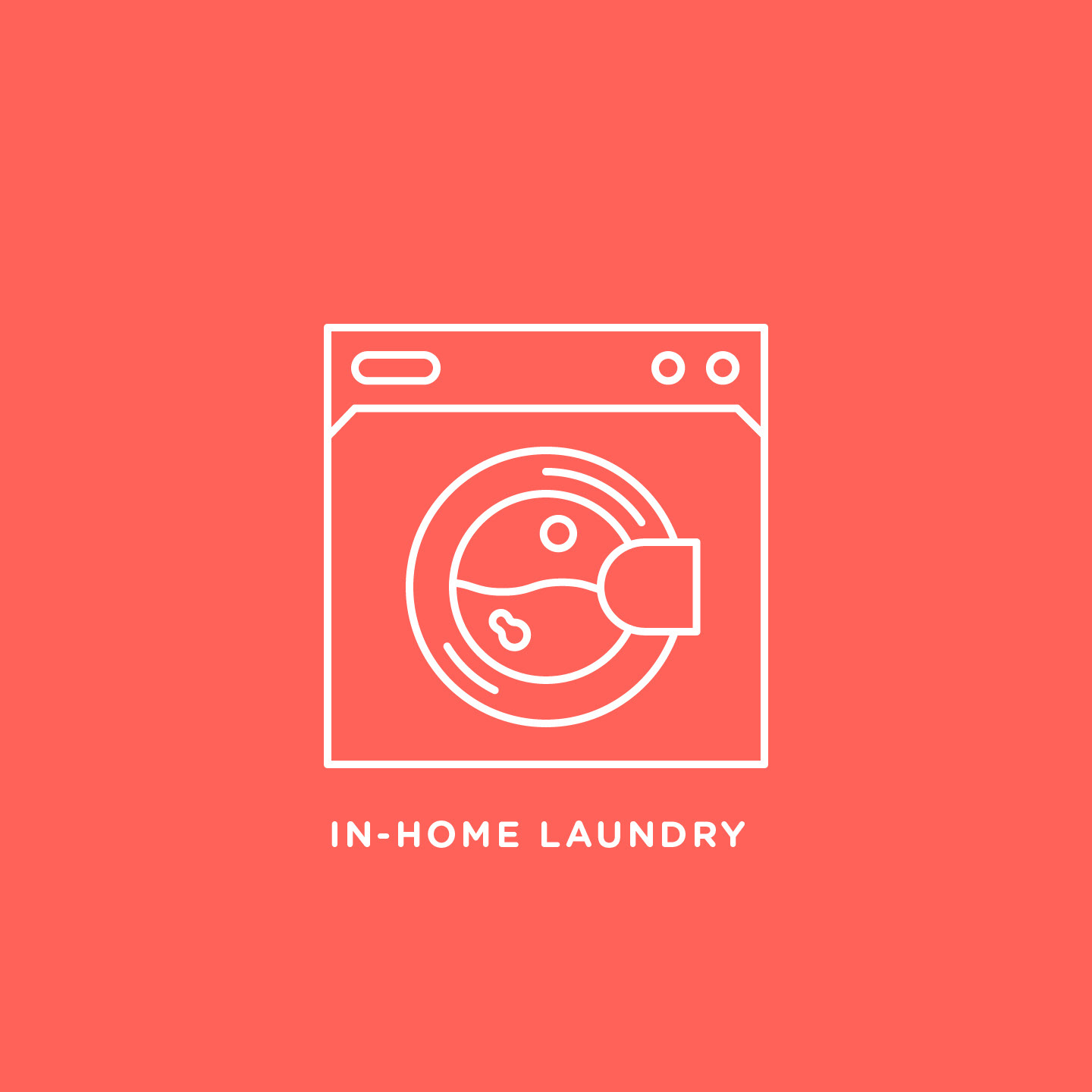

I designed and illustrated these icons to highlight the unique and appealing features a home can offer.